San Francisco Small Business Week (SFSBW)
Brand Redesign + Strategic Deployment
San Francisco Small Business Week (SFSBW)
SFSBW
San Francisco Small Business Week is a week-long series of programs dedicated to supporting San Francisco small businesses through a suite of dynamic workshops, panels, networking events, and other activations throughout the city.
Role
As SFSBW Committee Chair, I craft yearly themes, sponsor partnerships, organize committee members to produce programs (40+ dedicated events), implement strategic marketing, and oversee the production of the opening ceremony and closing celebration.
This year, I extended responsibilities to Creative Director for the SFSBW brand redesign
SFSBW Committee & Stakeholders
San Francisco Small Business Week is produced and sponsored by a series of public and private sector partners. I collaborate with all of these organizations to execute the creative vision behind each year's theme.
Brand Redesign
Why redesign?
SFSBW’s design language had become stagnant, running the risk of being perceived as a mundane small business support initiative sustained exclusively by tradition and habit rather than excitement and innovation.
Goal
Pay homage to what SFSBW has represented historically while ushering in the next generation of entrepreneurs, small business advocates, and customers with a dynamic design language that speaks to novel and refreshing ways to get excited about and support the small business community.
Legacy Brand Identity
Creative Direction
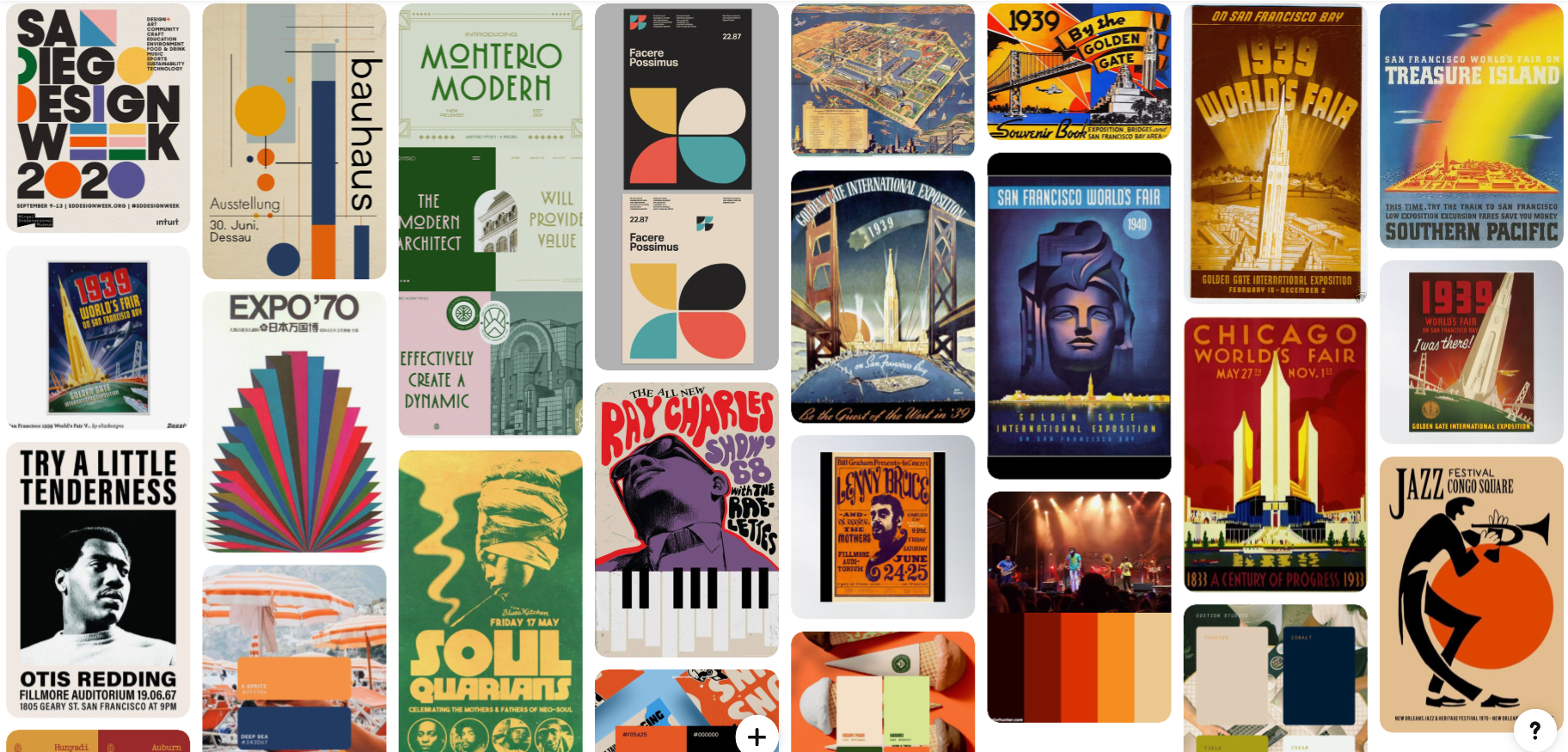
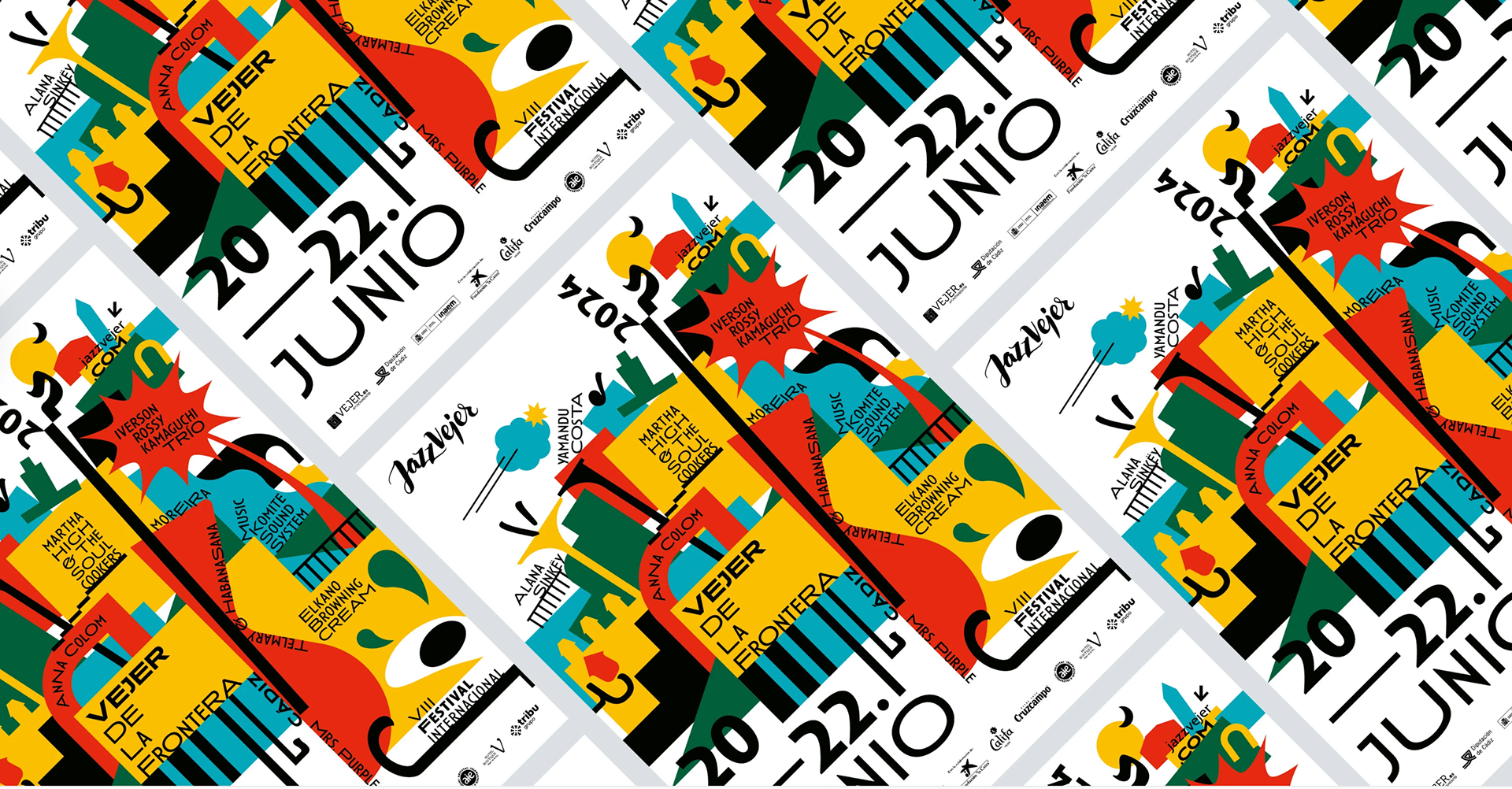
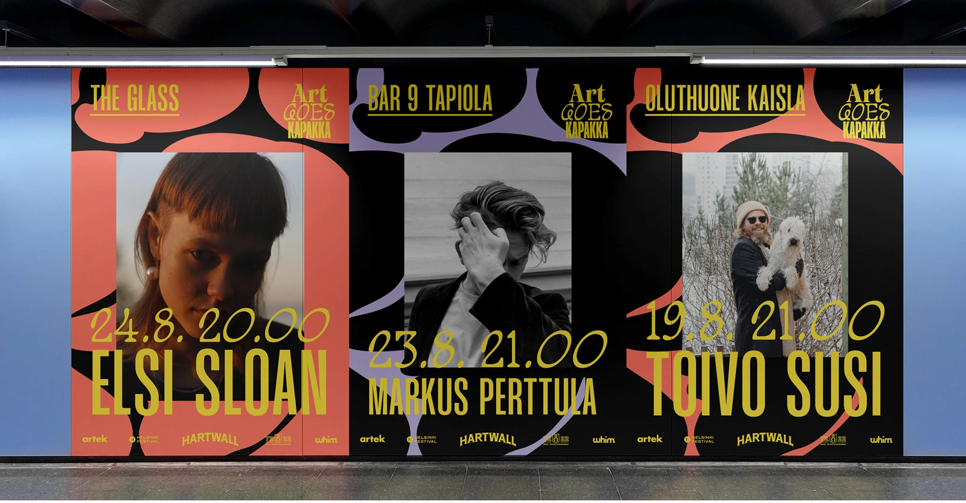
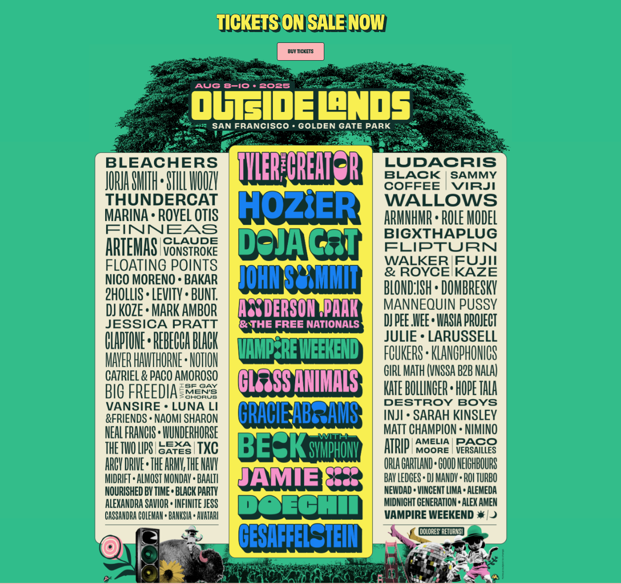
Music Festival Design and the 1939 Golden Gate International Exposition galvanized the ideation process for our redesign. The goal was to integrate the parent organization's new brand identity, the San Francisco Chamber of Commerce (SFCC), with these inspirations to create an identity unique to SFSBW, yet complementary to SFCC's design language.
Strategic Partnership
Graphic Design
Logo Exploration
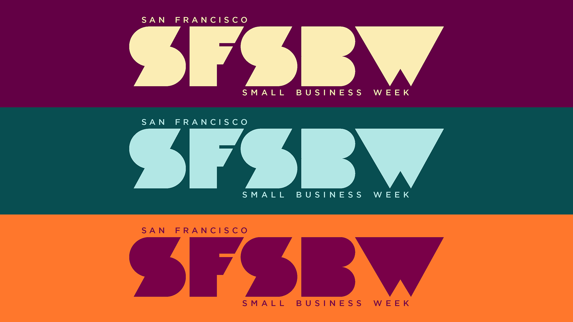
We wanted to capture a logo that can stand alone and work well with other designs for the foreseeable future. A series of directions were contemplated, but we ultimately settled for a version of design #3 as the best complement to the SFCC brand redesign and the overall longevity of the brand.
Art Deco anchors our logo design by complementing SFCC's existing aesthetic while responding to their redesign. This movement stripped away unnecessary ornamentation in favor of clean, functional forms—much like how small businesses focus on what works without pretense. Art Deco's emphasis on accessible sophistication aligns perfectly with small business values: delivering quality and creativity through ingenuity rather than excess.
Color, Type, & Illustrations
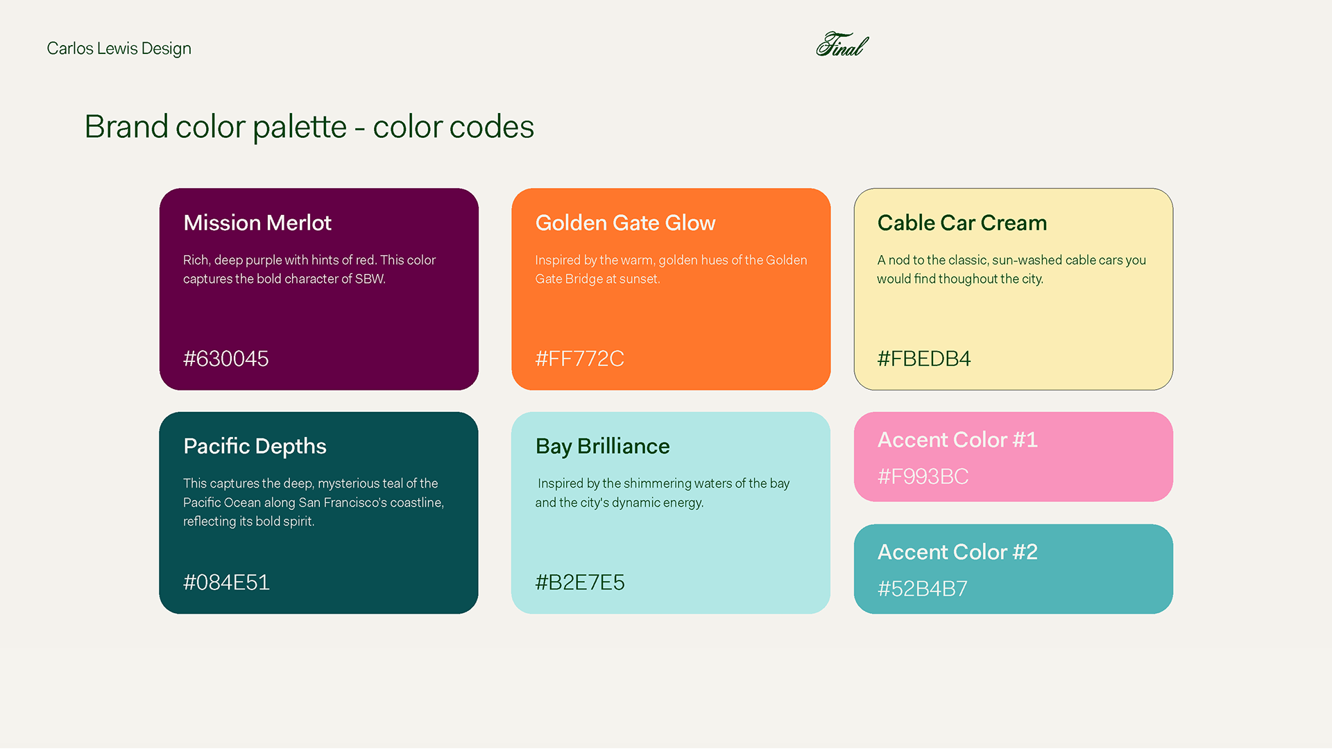
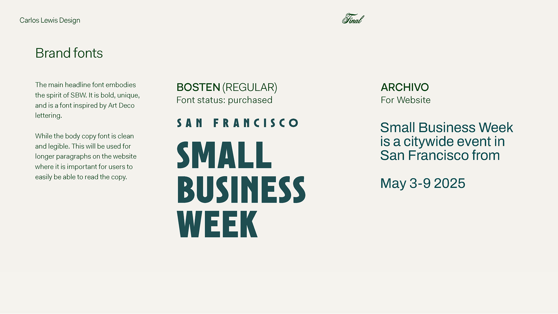
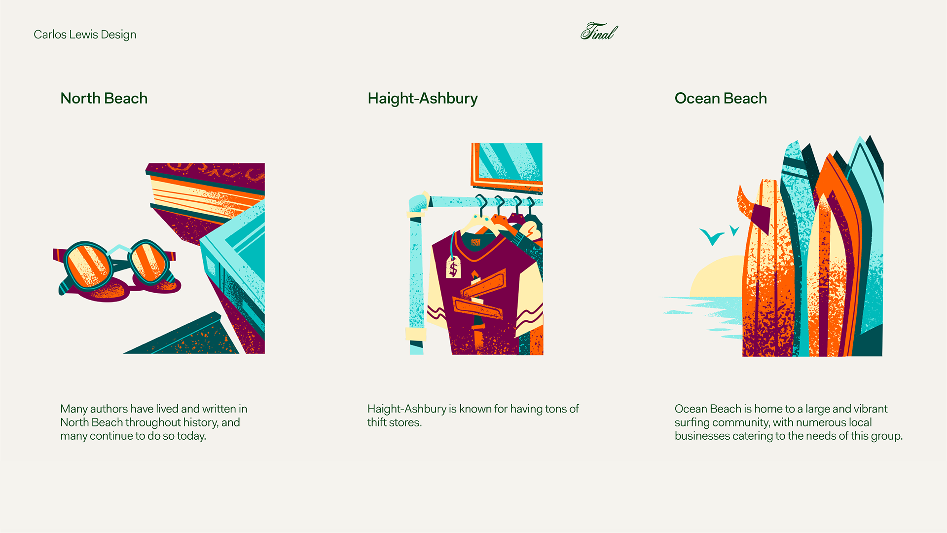
We settled on a color palette, type, and illustrations that both captured the essence of the city while paying homage to iconic neighborhoods and their small businesses.

Strategic Deployment
Deployment consisted of several stakeholder touchpoints, with the addition of new symbolic mediums to further enhance resonance
Marketing Collateral: Bus Stop Ads
Ads were hosted on Muni bus stops, engaging thousands of viewers across San Francisco
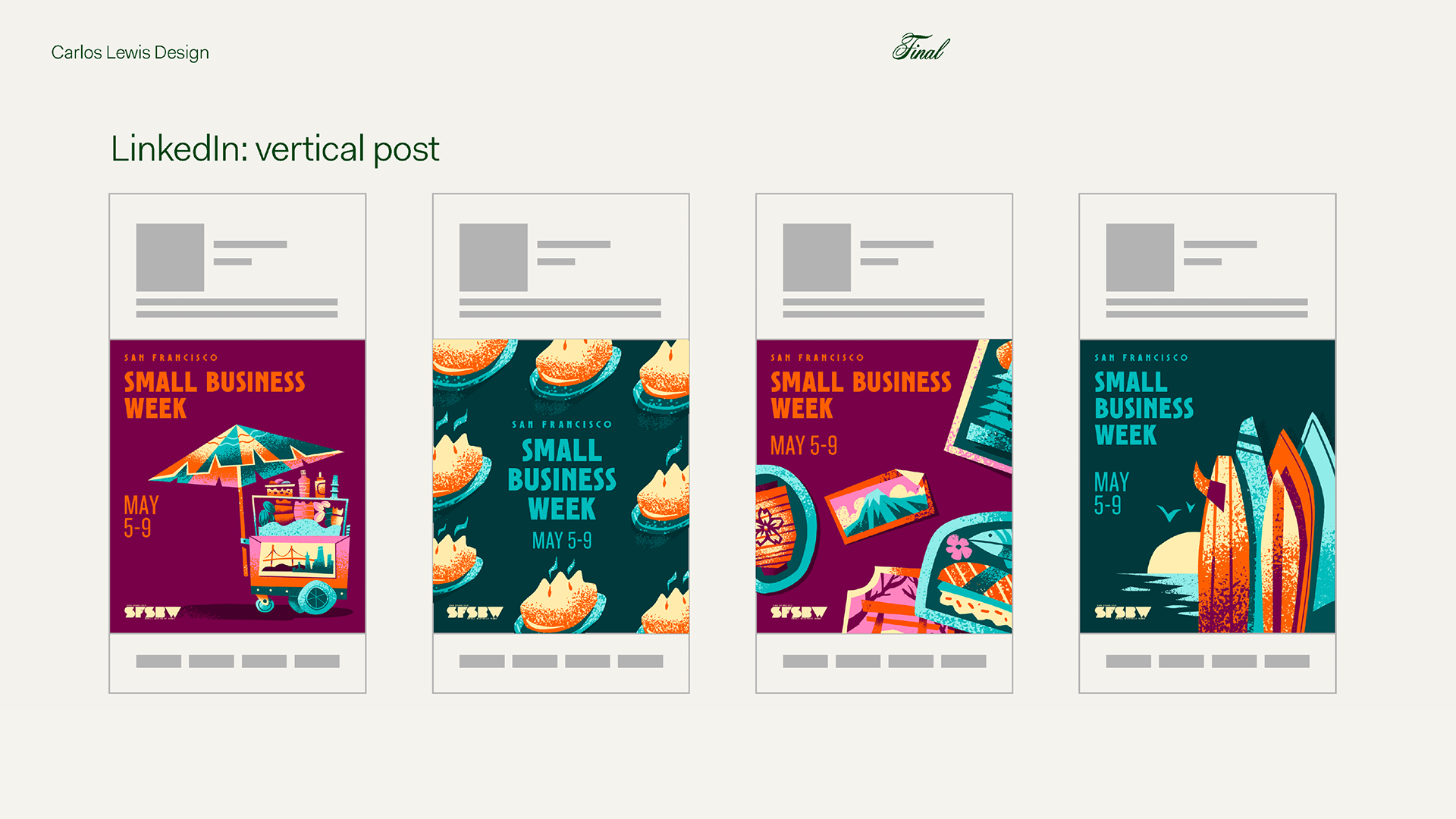
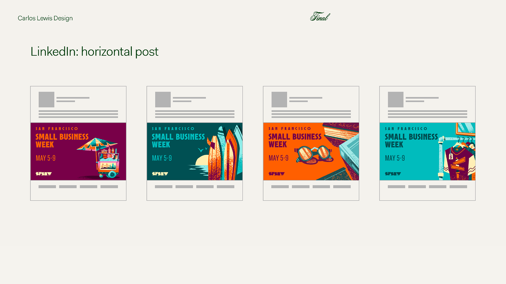
Marketing Collateral: Social Media
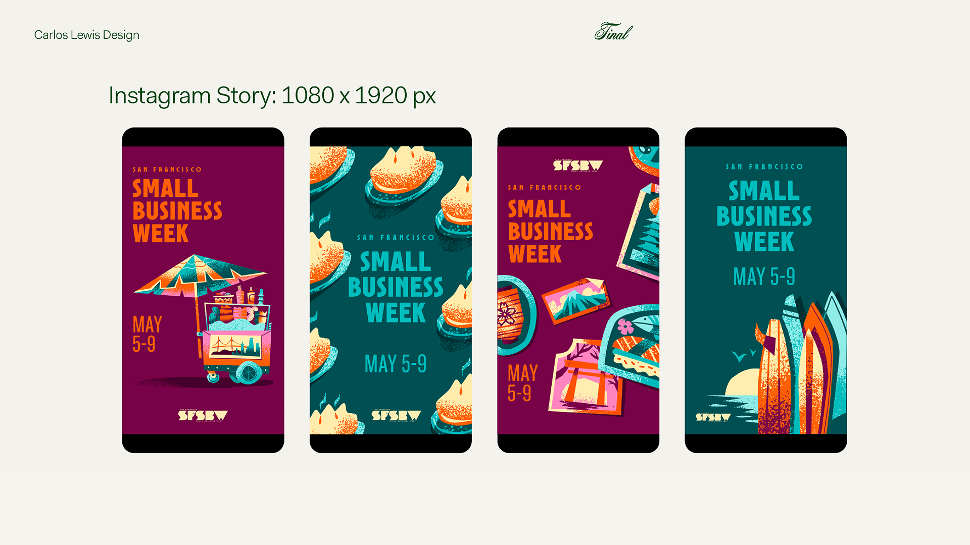
We focused on the two platforms with the highest engagement/conversion, Instagram and LinkedIn.

Marketing Collateral: Tangible Inputs
In order to further the event's impact, we wanted to create a multisensorial experience by expanding the branding to include merchandise and other tangible vehicles to increase resonance.
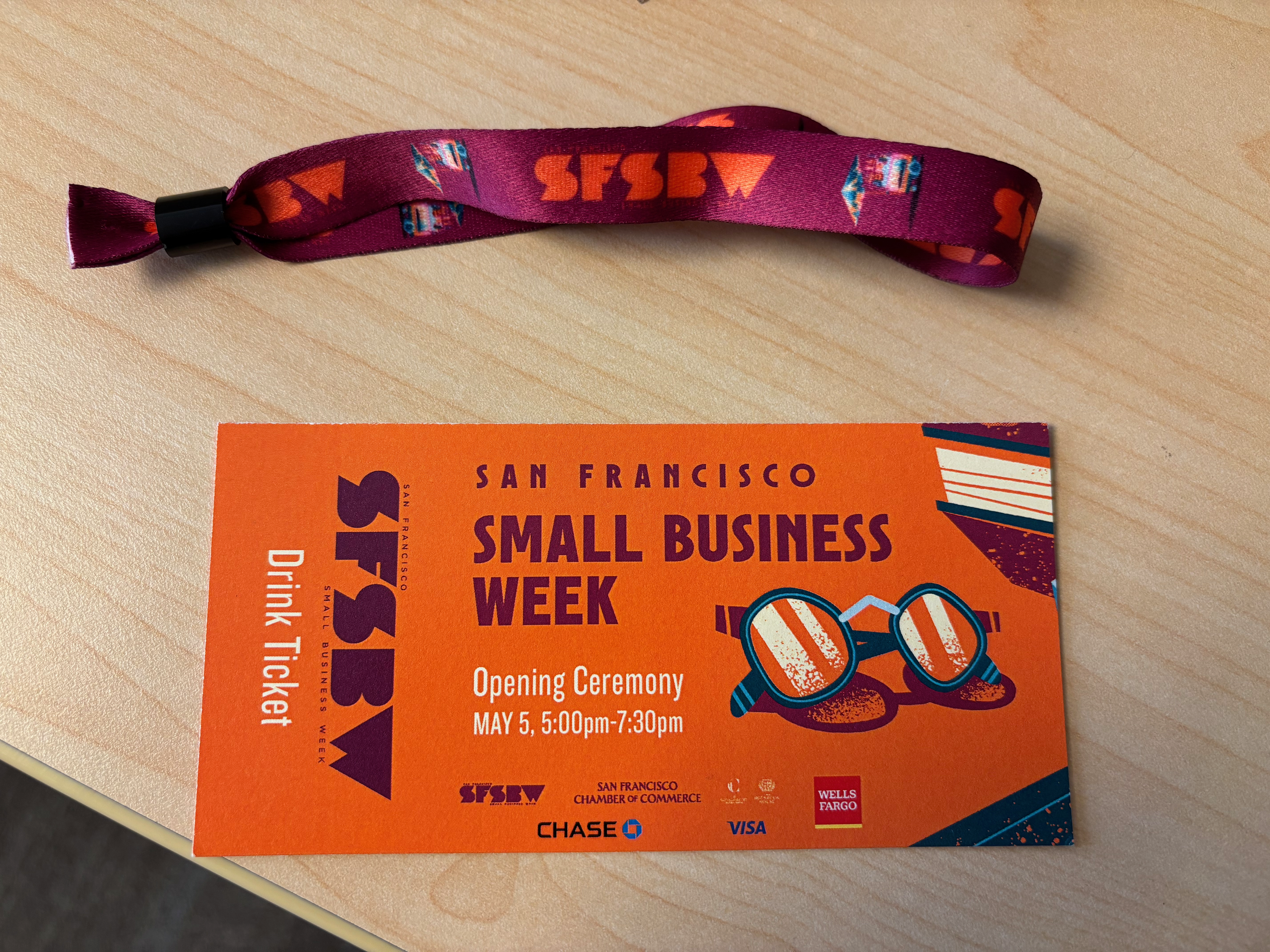
VIP Event Wristband + GA Ticket
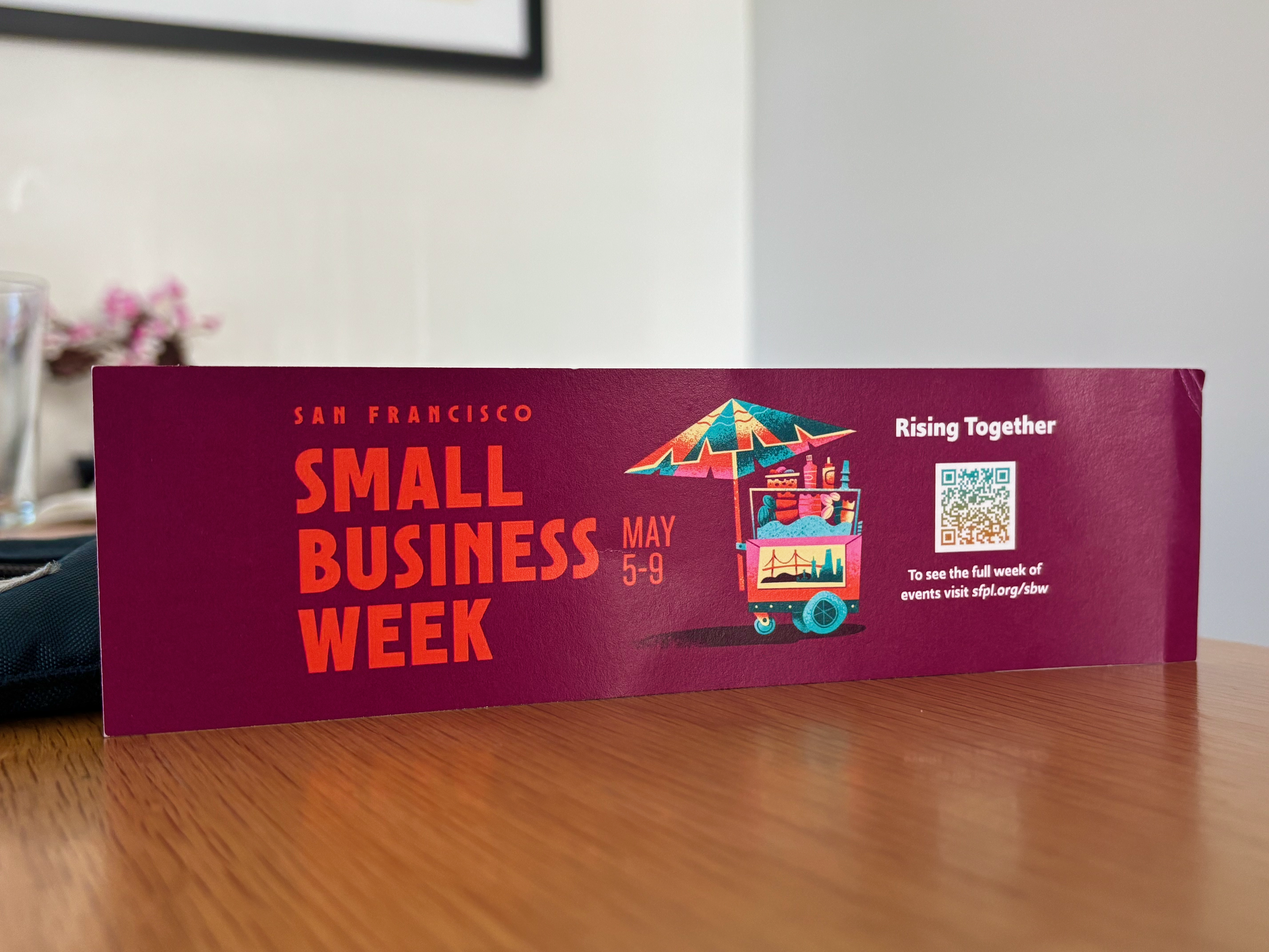
SF Public Library Bookmark
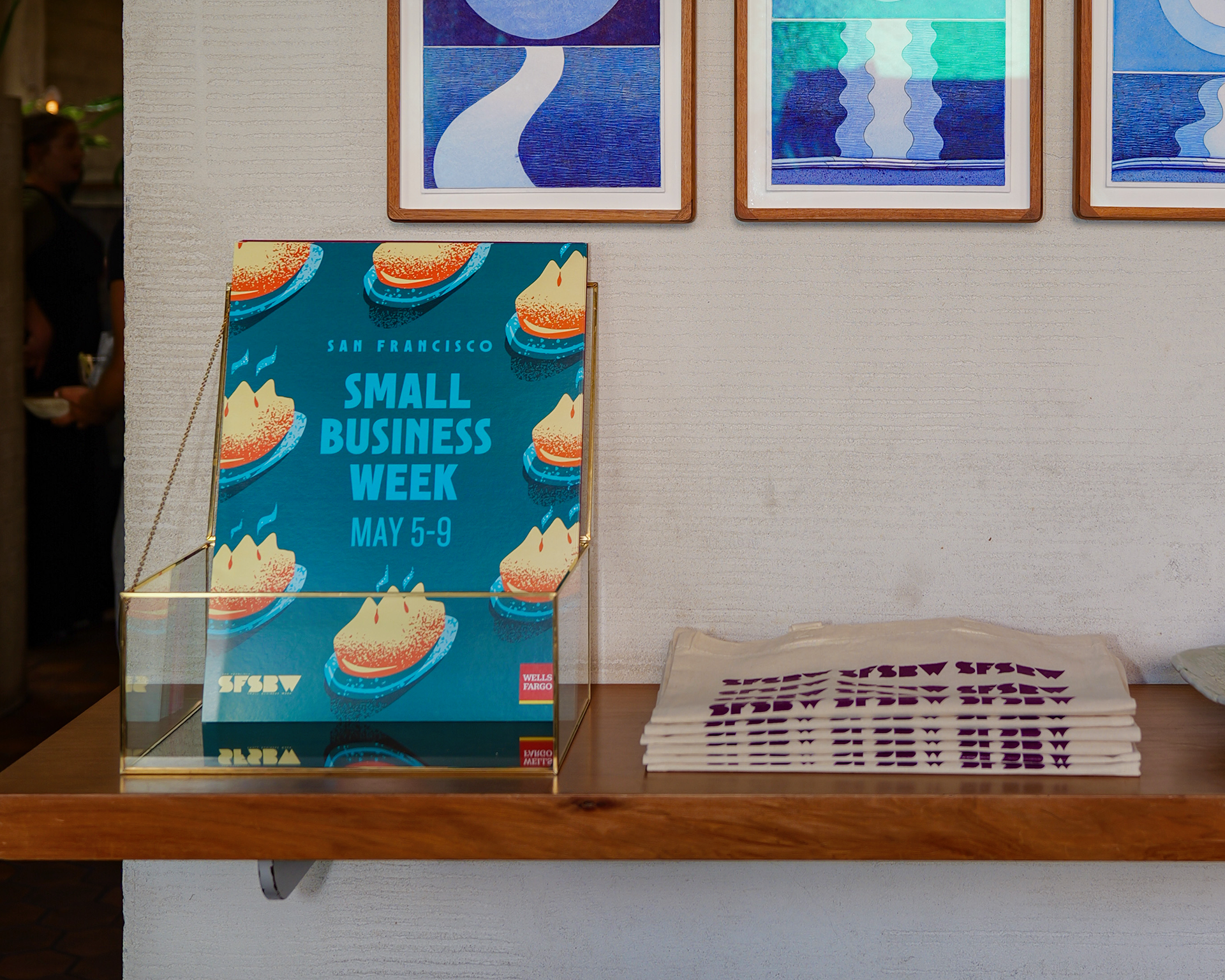
Event Poster + Branded Tote Bag
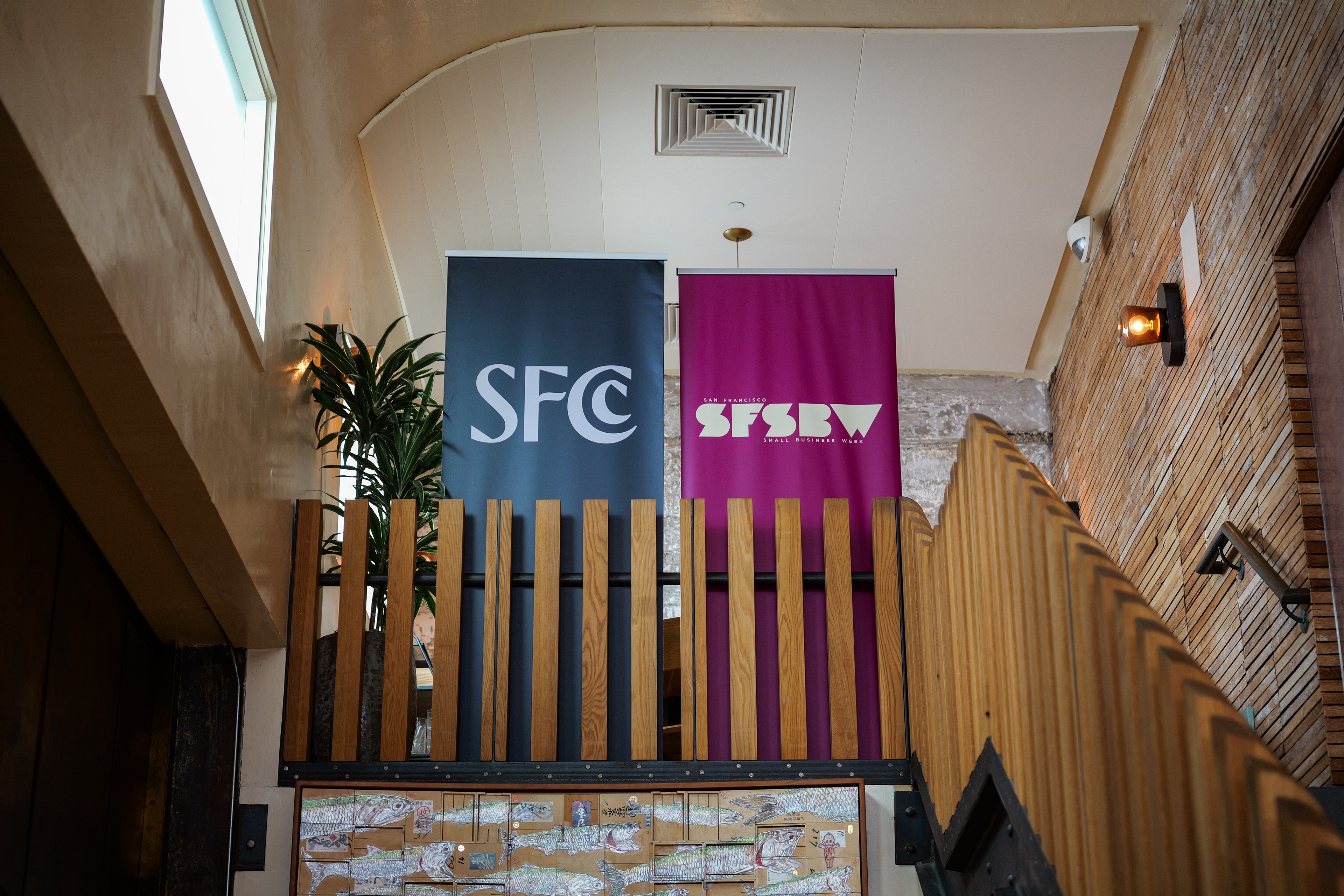
Stand up Banner
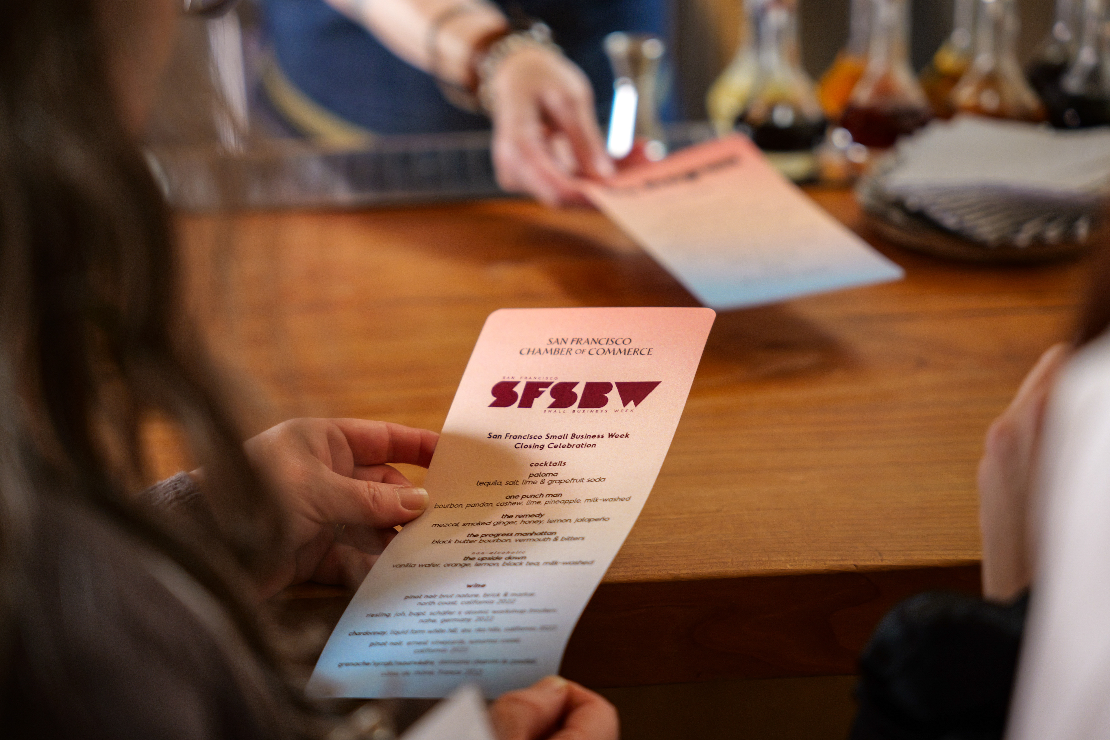
Custom Branded Event Menu
Results
Post SFSBW survey revealed an increase across all metrics and a sizeable reputation boost.

